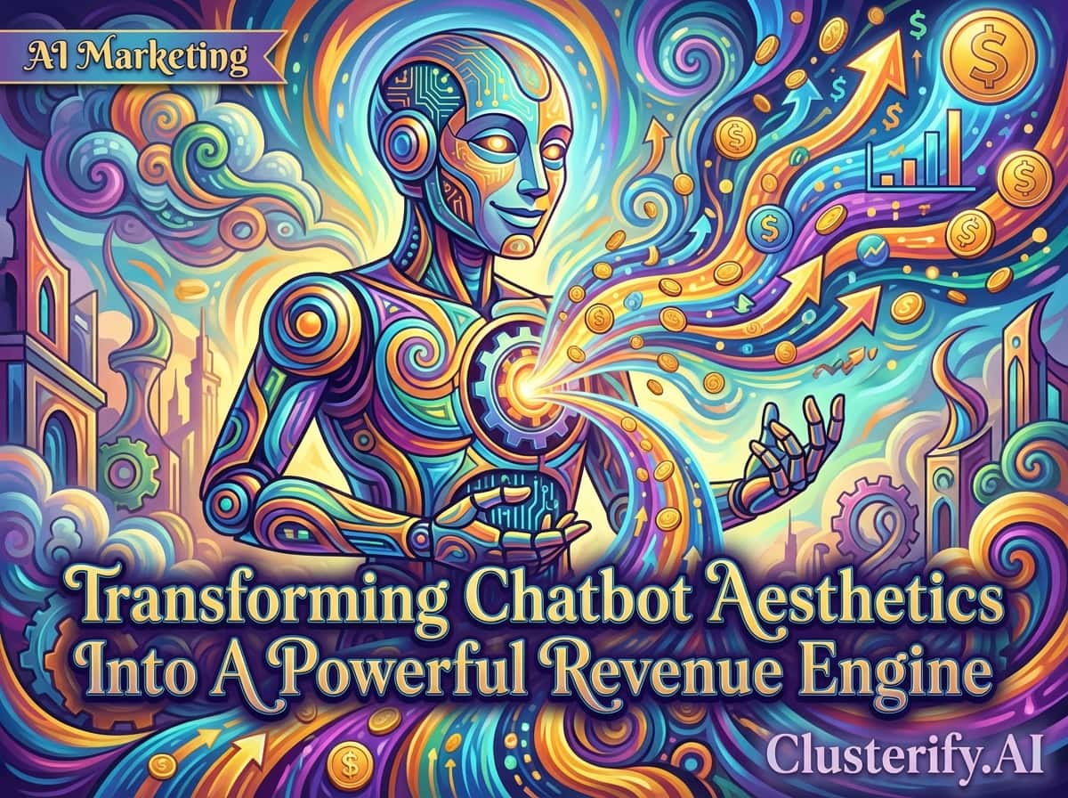
Is Your Digital Greeter Scaring Away Your Customers?
Why the `face` of your chatbot matters just as much as its `brain`—and how to turn aesthetics into revenue.
Imagine walking into a high-end luxury boutique. The lighting is perfect, the scent is subtle and expensive, and the merchandise is displayed like art. But then, a salesperson approaches you. They are disheveled, wearing a neon sandwich board that clashes with the store’s decor, and they stand uncomfortably close to your face, blocking your view of the products. Before you even hear what they have to say, your instinct is to turn around and leave.
This scenario plays out thousands of times a day on business websites across the globe. Companies invest heavily in the “brain” of their AI—the Natural Language Processing (NLP), the logic flows, and the database integrations—yet they neglect the “body” and the ‘face’ of the chatbot. They deploy a generic, intrusive, or poorly designed chat widget that acts exactly like that disheveled salesperson.
In the world of digital sales and marketing, design is not just decoration; it is communication. The visual interface of your chatbot is the very first touchpoint of conversational commerce.
This comprehensive guide explores why the visual design of your chatbot is a critical Conversion Rate Optimization (CRO) lever, the specific challenges marketing leaders face in perfecting it, and the strategic solutions that turn a passive widget into a proactive revenue generator.
The First Impression Problem: Why UI Eats AI for Breakfast
There is a common misconception in the tech world that functionality trumps aesthetics. While functionality is essential, human beings are visually dominant creatures. We process visual data 60,000 times faster than text. When a user lands on your site, they make a subconscious judgment about your brand’s credibility within 50 milliseconds. That is 0.05 seconds.
If your chatbot widget looks like a bolt-on afterthought, users perceive your customer service as an afterthought.
The Silent Observer
A well-designed bot sits quietly in the corner, visible but not obtrusive, waiting for a signal of interest.
The Helpful Guide
When engaged, it expands smoothly, offering clear options and readable text.
The Brand Ambassador
It wears the company uniform (colors, fonts, tone) and speaks the company language.
Conversely, a poorly designed bot is the equivalent of a greeter who jumps in front of you the moment you open the door, shouting generic lines. This creates friction. In the digital economy, friction is the ultimate conversion killer.
For Sales and Marketing Professionals, the shift in perspective must be absolute: Chatbot design is not an IT ticket; it is a marketing strategy. Every pixel of the chat window contributes to the User Experience (UX). If you are ready to upgrade your conversational strategy, start with a platform that understands the intersection of design and intelligence.
Section 1: The ROI of Good Design
Why should a CMO care about the border radius of a chat bubble? Because the psychological impact of User Interface (UI) on User Experience (UX) is directly measurable in dollars and cents.
- 1. The Aesthetic-Usability Effect Users perceive more aesthetically pleasing designs as easier to use. If your chatbot looks polished, users are more patient. If it looks clunky, users perceive the AI as “stupid” at the first sign of friction.
- 2. Trust Factors and Brand Consistency Trust is the currency of the internet. A default, unbranded chat icon signals: “This is a third-party tool we just plugged in.” Consistent presentation of a brand has been seen to increase revenue by 33%.
- 3. The Friction Factor Good design is invisible; bad design is glaring. Small fonts or poor contrast create physical friction. Buttons too close together create interaction friction. Every micro-moment of friction increases the likelihood of the user closing the chat.
Data Visualization Concept: The Trust/Lead Correlation
Imagine a scatter plot graph titled “User Interface Satisfaction vs. Lead Capture Rates.”
X-Axis:UI Satisfaction Score (Clarity, Branding, Ease)
Y-Axis:Lead Capture Rate (Contact info provided)
The Trend: As UI satisfaction moves from “Cluttered/Generic” to “Clean/Branded,” the lead capture rate climbs steeply. Users are simply more willing to give their email address to a well-dressed bot.
For a deeper dive into how AI can enhance your marketing funnel through design and logic, visit our AI Marketing page.
Section 2: The Core Challenges of Chatbot Design
Marketers and designers face a unique set of hurdles when trying to balance visibility, utility, and aesthetics. These are the “Dragons” you must slay to achieve high-converting conversational AI.
Challenge A: The Mobile Real Estate War
Designing for a 6-inch phone screen is a battle for pixels. The “Thumb Zone” (bottom center/right) is where the chat widget lives, but it’s also where “Add to Cart” buttons live. A poorly designed widget overlays critical navigation, literally blocking revenue.
Challenge B: Intrusiveness vs. Visibility
Marketers fear being ignored but should also fear being annoying. A passive icon is missed; an aggressive pop-up interrupts thought. Finding the “Goldilocks Zone”—where the bot is helpful but respectful—requires understanding user intent.
Challenge C: Accessibility & Inclusivity
Approximately 15% of the world’s population experiences some form of disability. Failures in color contrast, screen reader compatibility (ARIA labels), or motor control (tiny buttons) mean you are actively ignoring a significant portion of your market.
Challenge D: Humanizing the Artificial
How do you make a robot feel friendly without falling into the “Uncanny Valley”? The visual design sets the expectation for the tone. If the design is whimsical but the bot speaks legalese, the cognitive dissonance breaks the experience.
To explore how to balance automation with a human touch, check out our AI Automation solutions.
Section 3: Strategic Solutions & Best Practices
Identifying the challenges is step one. Solving them requires a strategic blend of design thinking and marketing logic.
Context-Aware Design One size does not fit all. On the homepage, keep it collapsed. On the Pricing page, expand after 30 seconds with a specific question like “Questions about Enterprise plans?”
The Mobile-Responsive Shift Use a “Floating Action Button” (FAB) that opens a full-screen modal on mobile. Manage Z-Index to ensure the widget never covers the checkout button.
The Design Impact Matrix
| Feature |
Poor Design Choice (Friction) |
Strategic Design Choice (Revenue) |
| Avatar |
Generic silhouette or stock photo. |
Custom branded mascot or real photo. |
| Launch Trigger |
Auto-opens immediately with sound. |
Triggers on “Exit Intent” or time-on-page. |
| Mobile View |
Covers “Add to Cart”; hard to close. |
Auto-minimizes; padding ensures visibility. |
| Copywriting |
“Hello. How can I help you?” |
“Hi! Looking for marketing tools? Let’s find a match.” |
Mastering Micro-Copy: The text inside the buttons is part of the design. Instead of “Submit,” use “Get My Free Guide.” Visual design and copy design must work in harmony.
Section 4: Real-World Scenarios
The Luxury Retailer
Challenge: High-ticket customers don’t want a robot; they want a concierge.
Design Win: Sleek midnight blue with gold accents. Serif typeface. Slides in elegantly rather than popping. It whispers “Private Consultation.”
The SaaS Disruptor
Challenge: Complex software overwhelms new users.
Design Win: Vibrant colors (purple/teal) and a friendly animated mascot. Heavy use of “Quick Reply” chips to guide users and reduce anxiety.
The Emergency Service
Challenge: Panic. Users need speed, not aesthetics.
Design Win: High contrast, large text. A prominent “Call Now” button in the header. Function over form reduces bounce rates.
For businesses looking to implement these types of intelligent, industry-specific solutions, exploring a Knowledge Graph approach can help structure the data behind the design.
Deep Dive: The Psychology of Color
Blue: Trust, Security (Banks, SaaS)
Green: Growth, Go (FinTech, Sales)
Orange: Urgency (Clearance)
Pro Tip: Use your brand’s secondary or accent color for the widget to make it stand out without clashing.
Conclusion: Design is a Revenue Driver
We have moved past the era where having a chatbot was a novelty. Today, it is a standard expectation. Your chatbot is likely the most interactive element on your entire website. To treat its design as secondary to its code is a fundamental error in digital strategy.
As you review your marketing stack for the coming quarter, take a hard look at your chat widget. Does it look like a trusted advisor, or does it look like a piece of spam? The answer to that question is directly impacting your bottom line.
Ready to Elevate Your Conversational Strategy?
Don’t let poor design bottleneck your sales funnel. It is time to audit your digital ambassador.
Or learn more on our AI Blog.