The Evolving Paradigm of Dynamic Styling in CSS
The landscape of Cascading Style Sheets (CSS) is undergoing a significant architectural evolution. The user query regarding a “CSS if statement” points to a broader, transformative trend: the migration of conditional styling logic from external scripts, like JavaScript, directly into the core of CSS itself. This report provides a detailed analysis of this paradigm shift, examining the journey from established conditional methods to the powerful new capabilities on the horizon. This is not about a single new feature but a fundamental enhancement of CSS’s declarative power, enabling more resilient, maintainable, and performant front-end architectures.
This analysis will navigate through the key stages of this evolution:
- Legacy and Classic Conditionals: The foundational at-rules (
@media, @supports) and selector-based techniques that have long served as the bedrock of responsive and adaptive design.
- The New Inline Conditional: The experimental
if() function, a game-changing feature that moves conditional logic to the property level, co-locating a style declaration with the logic that governs its value.
- The Future of Conditional Blocks: The proposed
@when and @else at-rules, which promise a more ergonomic and logically sound syntax for handling complex, chained conditional style blocks.
By dissecting these mechanisms, this report will illuminate how CSS is evolving from a language of static presentation rules into a more dynamic and context-aware styling engine, fundamentally changing how developers approach building modern user interfaces.
The Foundations of Conditional Styling: A Retrospective
To fully appreciate the significance of new features like the if() function, it is essential to understand the historical context of conditional styling in CSS. While CSS has always been inherently conditional—applying styles only when certain conditions are met—the methods for defining these conditions have evolved dramatically. This evolution represents a clear trajectory from static, compile-time tools toward increasingly powerful and ergonomic runtime mechanisms native to the browser.
Section 1.1: Pre-Processor Conditionals: The Compile-Time Approach
For many years, the most direct form of if/else logic available to front-end developers came not from CSS itself, but from CSS pre-processors like Sass or Less. These tools introduced programmatic constructs directly into stylesheets, allowing for complex conditional logic during development.
A typical Sass conditional block looks like this :
This approach offers significant power for theming, generating variations of a component, or managing complex design systems. However, its primary limitation lies in its evaluation time. All pre-processor logic is resolved during the build or “compile” step, before the CSS is ever sent to the browser. The output is a static CSS file. This means pre-processor conditionals are fundamentally incapable of reacting to dynamic, in-browser conditions such as changes in viewport size, user interactions (:hover, :focus), or the browser’s feature support set. They operate within a static boundary, unable to cross into the runtime environment of the user’s browser.
Section 1.2: The Classic Runtime Solution: JavaScript and Class-Based Toggling
The most common and enduring method for applying dynamic, conditional styles at runtime has been the combination of JavaScript and CSS classes. In this pattern, JavaScript logic listens for events, checks application state, or detects environmental conditions, and then manipulates the Document Object Model (DOM) by adding, removing, or toggling class names on elements.
A simple implementation might look like this :
While powerful and universally supported, this technique creates a strong and often brittle coupling between the application’s behavior (JavaScript) and its presentation (CSS). A developer must maintain a “contract” where class names in the CSS perfectly match the strings used in the JavaScript. A change in one file necessitates a corresponding change in the other, increasing cognitive load and creating a common source of bugs. In large, complex, or long-lived applications, this tight coupling can significantly hinder maintainability and increase the total cost of ownership. A primary motivation for developing more powerful native CSS conditionals is to sever this dependency and allow for a cleaner separation of concerns.
Section 1.3: Native CSS Conditionals: At-Rules and Pseudo-Classes
CSS has long possessed its own native, runtime conditional mechanisms in the form of at-rules and pseudo-classes. The most well-known are @media queries, which apply styles based on viewport or device characteristics, and @supports queries, which apply styles based on the browser’s support for a given CSS feature.
This code explicitly states: if the viewport width is 700px or greater, change the flex-direction. More recently, powerful pseudo-classes like :has() have introduced structural and state-based conditions, allowing developers to style an element based on its descendants.
The historical progression of these native features reveals a clear trend: a shift from global context to increasingly local context.
@media queries are global, tied to the entire viewport.@supports queries are also global, tied to the capabilities of the user agent.- The introduction of Container Queries (
@container) marked a pivotal change, allowing a component to respond to the dimensions of its immediate parent container, not the entire page.
This trajectory towards more granular, component-level context awareness is a direct precursor to the logic embodied by the if() function, which takes this evolution one step further to the level of self-context.
The “Game Changer”: In-Depth Analysis of the CSS if() Function
The experimental if() function represents a paradigm shift in CSS architecture. It moves conditional logic from the rule level (e.g., an entire @media block) down to the property level (inside a single declaration). This enables developers to co-locate a property with all of its potential values and the logic that governs them, resulting in highly readable, self-contained, and maintainable component styles.
Section 2.1: Syntax and Core Mechanics
The if() function, currently available as an experimental feature in Chrome 137 and later, provides a concise syntax for inline conditional value selection. It operates as a series of condition-value pairs, followed by an optional else fallback.
The general structure is as follows :
It is critical to understand that if() is not a generic boolean function capable of evaluating arbitrary expressions. It is a specialized construct designed to work exclusively with three specific query functions :
media(): For evaluating media query conditions.supports(): For evaluating feature support conditions.style(): For evaluating the computed value of a custom property on the element itself.
This constraint is by design. It ensures that the function’s logic remains within the performant, well-defined boundaries of the browser’s existing query mechanisms. The if() function is best understood as a powerful piece of syntactic sugar and a co-location tool, not the introduction of a full-fledged programming language into CSS.
Section 2.2: Practical Implementation and Use Cases
The true power of the if() function is revealed through its practical applications, which streamline existing patterns and unlock new architectural possibilities.
Inline Media Queries with media()
The if() function offers a more concise way to apply single-property changes based on media queries, avoiding the need for a separate @media block. This is especially useful for minor adjustments.
Classic Approach:
if() Approach:
In this example from a Chrome developer article, the logic for the width property is co-located directly with the property itself, making the component’s styling intent immediately clear.
Inline Feature Detection with supports()
Similarly, if() can be used for inline feature detection, providing a fallback for browsers that do not support a given CSS feature.
This code attempts to use the modern, wide-gamut oklch color, falling back to a standard hex color if the browser does not support it. However, this technique presents a “progressive enhancement paradox.” For the supports() check to be evaluated, the browser must first support the if() function itself. Since if() is currently experimental, this pattern is primarily useful for testing other bleeding-edge features within browsers that are already on the cutting edge. It is a forward-looking tool, not a mechanism for providing fallbacks to older, legacy browsers.
State-Driven Styling with style()
The most transformative application of if() is its combination with the style() query function. This allows an element to change its styles based on the value of its own custom properties. This pattern is often used with the attr() function to pull state from an HTML attribute directly into CSS.
Consider a card component with different visual states (pending, complete, inactive) defined by a data-status attribute :
HTML:
CSS:
This pattern effectively creates a “self-container query.” While traditional container queries allow an element to respond to its parent, if(style()) allows an element to respond to its own state, as represented by its custom properties. This is a monumental step toward true component encapsulation in CSS. The component’s entire state-based styling logic is self-contained, decoupled from its parent’s structure or global state, making it more portable, reusable, and resilient.
Advanced Interaction with :hover
The if() function can also be used to create more decoupled interactions, such as reacting to a hover state on an ancestor element without using a descendant combinator.
HTML:
CSS:
In this example, the .card-icon is not styled with .card-container:hover.card-icon. Instead, it reacts to the --is-hovered custom property. This decouples the child from the parent’s specific state selector, making the component’s internal structure more flexible and easier to refactor.
Visualizing the Process: Browser Rendering Flow
Understanding how a browser processes different conditional logic mechanisms reveals why native CSS solutions are often more performant and reliable than those requiring JavaScript intervention. The following diagrams illustrate the browser’s rendering flow for each approach.
Section 3.1: Primer on the Critical Rendering Path
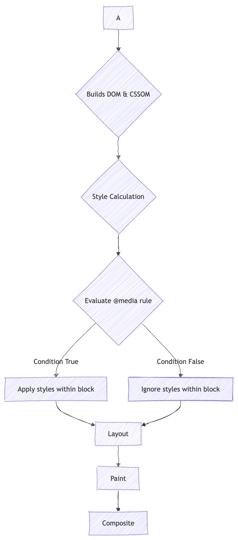
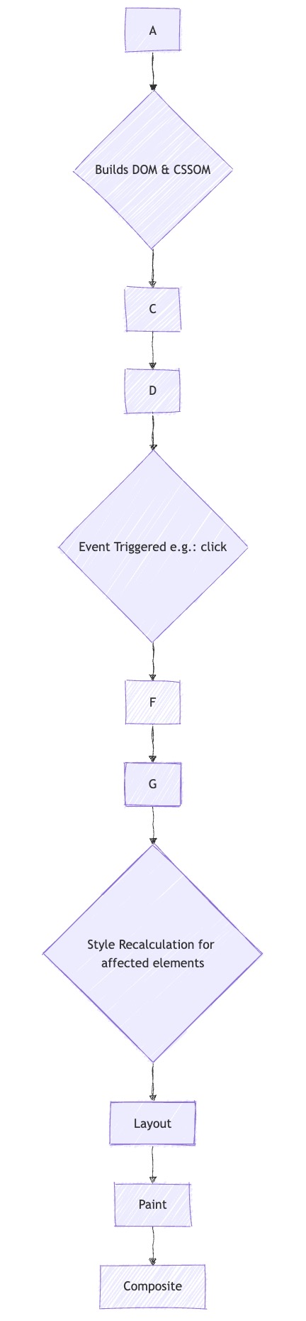
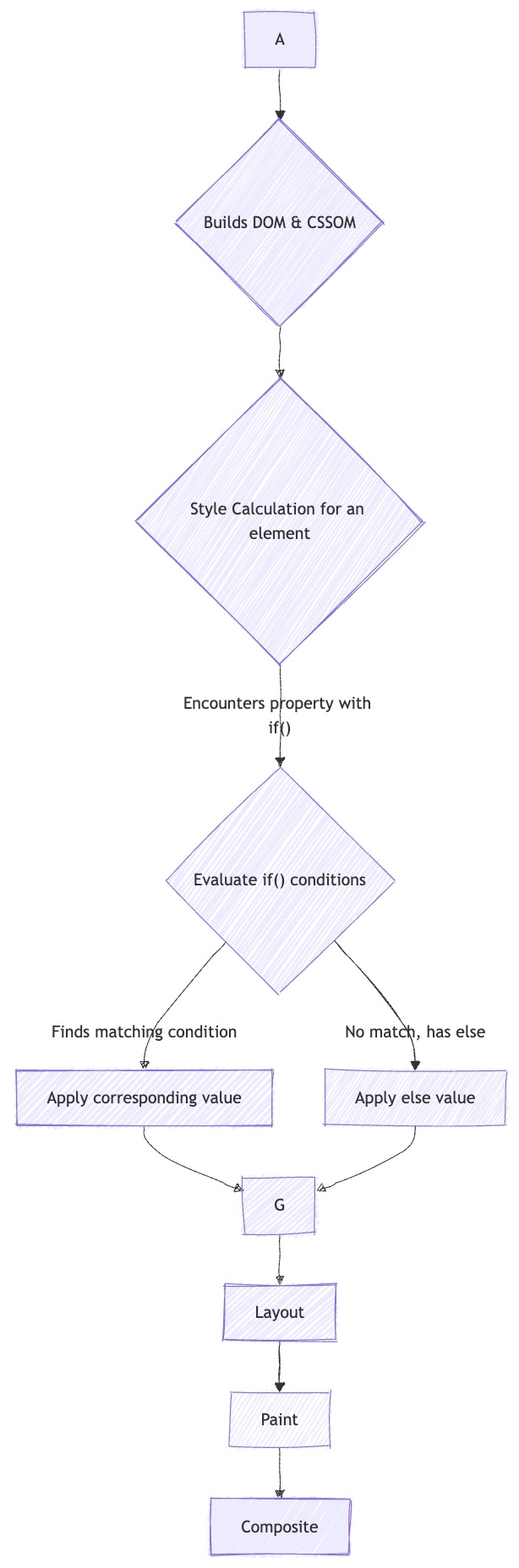
The browser renders a web page through a sequence of steps known as the Critical Rendering Path. In simplified terms, it parses HTML to build the DOM and parses CSS to build the CSSOM. It then combines these to create the Render Tree. The subsequent steps are:
- Style: Calculate the final styles for each element.
- Layout (or Reflow): Calculate the geometry (position and size) of each element.
- Paint: Draw the pixels for each element to layers.
- Composite: Combine the layers into the final image displayed on the screen.
Efficient rendering aims to keep this pipeline flowing smoothly. JavaScript interventions that modify the DOM can force this process to restart from the Style or Layout phase, which can be computationally expensive.
Section 3.2: Mermaid Chart 1: Classic Media Query Processing Flow
Native CSS at-rules like @media are evaluated efficiently during the initial Style calculation phase.
Section 3.3: Mermaid Chart 2: JavaScript-based Class Toggling Flow
JavaScript-based toggling introduces additional steps and can trigger a full recalculation of styles and layout, interrupting the rendering pipeline.
Section 3.4: Mermaid Chart 3: if() Function Processing Flow
The if() function is resolved inline during the Style calculation for an individual element, making it a highly efficient, localized operation.
